

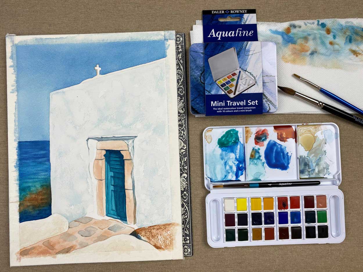
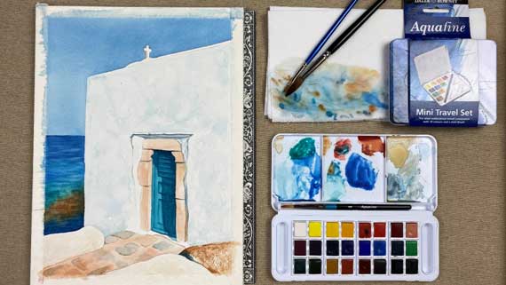
Coloring with Aquarelle with Arches & Aquafine
Ms Marion Koubouri from theartflip.com shows us step by step how to paint with watercolors a summer island landscape with professional colors!
We will need:
- 1 aquarelle set Daler Rowney Aquafine 10-24 colors
- Aquarelle paper Arches 100% Cotton, Rough ή Fine Grain, Cold Pressed 300gms
- Aquarelle brushes no3, no5, no10
- Absorbent kitchen paper or cloth
- A glass with water
Colors that we will need:
Sky Blue
If there is Prussian Blue 135, otherwise we can mix:
- Ultramarine Blue 123
- Cerulean Blue 112
- Cadmium Red 503
Yellow walls:
- Yellow Ochre 663
- Burnt Sienna 221
Blue walls:
- Ultramarine Blue 123
- Cerulean Blue 112
- Cadmium Red 503
Very diluted
Stones, Door Frame and Floor
If there is Portrait Pink 578, otherwise we can mix:
- Yellow Ochre 663
- Alizarin Crimson 515
- Ultramarine Blue 123
Blue door
- Cerulean Blue 112
- Viridian 382
- Prussian Blue 135 (για τις σκιές)
Sea
- Prussian Blue 135
- Cerulean Blue 112
- Viridian 382
- Burnt Sienna 221
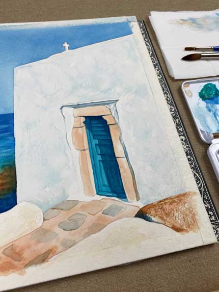
Process:
- Wet the area that corresponds to the sky with clean water and apply evenly with a no 10 brush, the blue shade we made. The color is more intense on the upper side of the sky and thinner / brighter towards the sea and we let the color dry.
- Wet the sea part with water and start painting from the top (from the horizon line) down first with the darkest blue shade (Prussian Blue) and then with the turquoise (Cerulean Blue), the emerald green (Viridian).
- At the point where the rocks appear, we leave a few drops of Burnt Sienna.
- At the bottom, the sea becomes darker, there we paint again with the dark blue shade (Prussian Blue).
- Then we paint the door with the intense turquoise we made with Cerulean and Viridian
- We paint the wall around the door blue, leaving some spots intact, that is, all white.
- We paint the door frame with the beige shade.
- With the same color, we color the floor after first wetting the point that corresponds to it. When it dries, form the tiles on top, some with Burnt Sienna and others with blue Ultramarine.
- We paint the shadows around the door with a gray shade that we make with Yellow Ochre, Alizarin Crimson and Ultramarine Blue.
- The terraces are painted in the yellow shade we made with Yellow Ochre & Burnt Sienna.
Watch the detailed video with aquarelle painting here:
https://www.youtube.com/watch?v=VVOSbcHYhlw
General Aquarelle Features
Watercolors (aquarelles) are water-soluble, characterized by transparency, clarity and purity, characteristics that make them different from other watercolor paints (watercolors, tempera, gouache).
Watercolor is characterized by the simplicity of its materials. To paint with watercolor we need paints, 1 brush, 1 sheet of paper and water.
Aquarelle has the reputation of being a "disobedient" technique. Unlike other, more "stable" painting media - oils, acrylics, pencils, charcoal, pastels, tempera - it is very fluid. It is a transparent amount of water that spreads on the paper giving each time a different result, which depends on the amount of water, the color, the speed of the stroke.
- IT IS WATER-BASED AND FLUID
Aquarelle is a concentrated, water-soluble pigment of mineral or synthetic origin. It dissolves with enough water and is transparent, it is a water color. Just like water, it flows and moves in every direction. The amount of water determines the result of the painting.
- IT IS TRANSPARENT
Unlike other watercolors (tempera / gouache), where each layer of paint covers the previous one, the watercolor is transparent, as a result each previous touch is visible even if we pass many layers of color on top. The colors "mix" and create a new shade.
- IT HAS NOT A WHITE SHADE
The absence of white forces us to keep the white of the paper in the areas we want to look white or bright. In acrylics, oils, pastels, any color becomes lighter with the addition of white to it. Instead of white in aquarelle, we add more water to make the colors more sparse & transparent and to make the white of the paper visible.
- LESS CORRECTION
It is absorbed quickly from the paper and once it dries there is not much room for "corrections". With the help of a harder brush we can lift a small amount of color, creating more light and contrast in some places or slightly correcting the contours.
- IT CHANGES AS IT DRIES
The colors look much more vivid and bright as they are liquid, more dull and light when they dry. This makes the aquarelle even more unpredictable. We learn to try colors and explore them. The shade in the box is completely different from the water-diluted color in our palette. This in turn changes when it dries on paper.
We thank Ms Marion Koubouri and theartflip.com & theartflipschool.com for this amazing creation!