

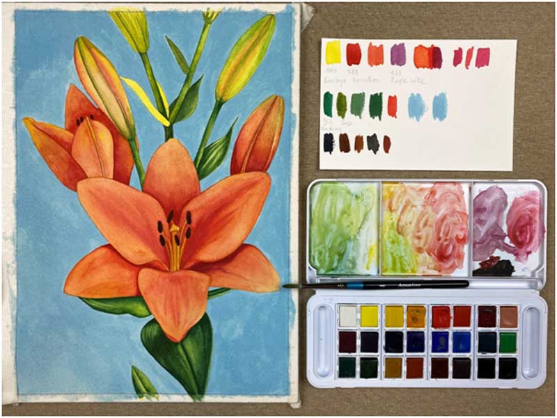
Coloring “Lilies” flowers with Aquafine aquarelle & Simply Watercolor Pad of Daler Rowney!
Marion from the theartflip.com shows us step-by-step how to color with aquarelle colors amazing lilies flowers with professional colors!
We will need:
Yellow base under leaves and petals
- Gamboge Yellow Hue 640
Petals
- Vermillion Hue 588
Shadows on the petals
- Alizarin Crimson Hue 515
Leaves
- Gamboge Yellow 640
- Hookers Green Dark 352
- Sap Green
Stamens
- Burnt Umber 223
- Payne’s Grey 065
Background
- Prussian Blue 135
- Viridian Hue 382
- Titanium white Gouache
Process:
Watercolor due to the transparency that characterizes it, it is the ideal medium / material to paint in multiple layers. Each subsequent layer makes the colors brighter and richer, as they continue to be seen through the transparency of the layers.
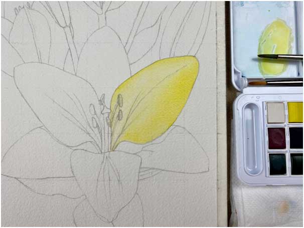
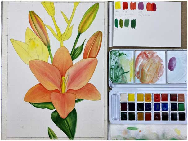
Step 1st
We paint with yellow Gamboge all the shapes, such as, the flowers, the petals, the buds, the stalks and the leaves.

Step 2nd
After the 1st layer (the yellow color) dries, we paint the petals with orange Vermillion, starting from very dilute orange, very transparent to wet one by one the petal.
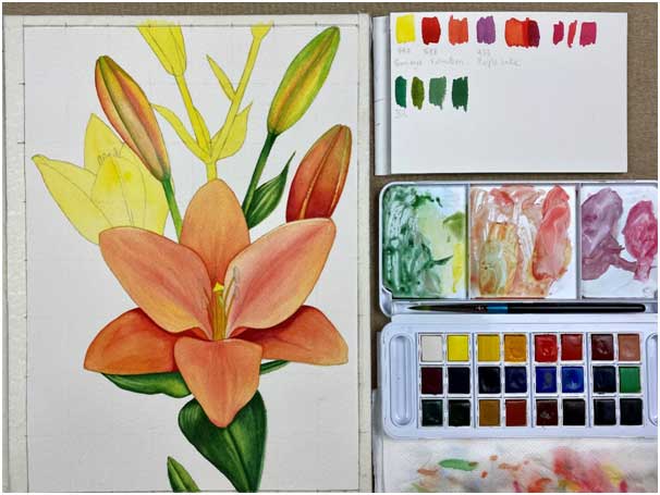
Step 3rd
Where intensity is needed, we add more orange to the petals to create volume and contrast.
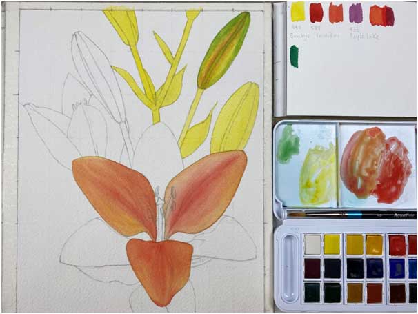
Step 4th
With diluted green Sap Green, we pass each leaf one by one, so that the surface gets wet and then we add more intense green in the places where it is needed, in order to create volume, light and shadow.
We repeat steps 3 and 4 as many times as needed, each time by adding more orange or green to the areas where there is a strong color.
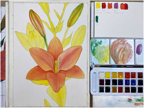
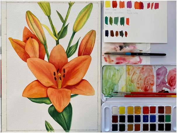
Step 5th
With the bright purple red Alizarin Crimson, on dry paper, we create the shadows under the petals, in the places where there is shadow.
Step 6th
With the bright green Hooker’s Green we emphasize the shadows on the leaves.
Step 7th
With brown burnt umber we color the stamens. Once the color is dry, we add a small touch of black Payne’s Gray to each stamen for contrast and volume.
Step 8th
We add the shades of Viridian and Prussian Blue in white tempera Titanium White. We cover the whole background with color. Gouache, unlike watercolors, contains chalk and is opaque. The use of tempera in our background ensures a more uniform result.
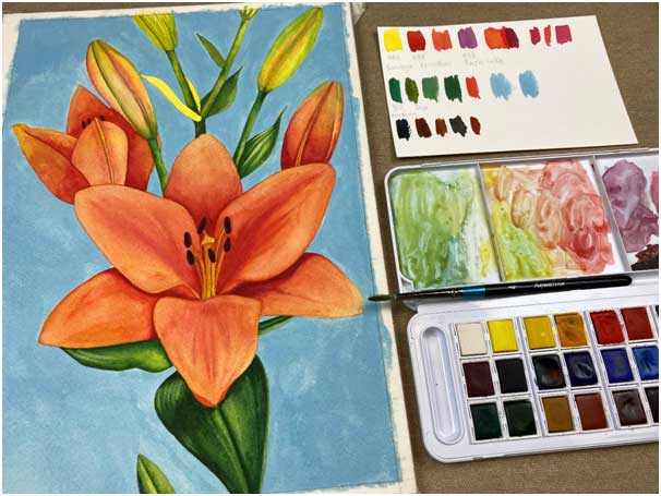
The beauty in this work lies in the harmony and richness of colors. The orange shades of the flowers were enriched using layers of the basic colors from which orange emerges: yellow and red in different layers.
The blue / blue background is the complementary shade of orange, when combined in a work they create a harmonious contrast that makes the colors radiate.
Good luck!
You can see the video:
We thank Mrs marion Koubouri from the theartflip.com & theartflipschool.com for the amazing creation!